I’m excited to show off my newest Shiny app, the Texas Precinct Explorer! The app is designed to provide a large volume of Texas political data at your fingertips to advise your thinking about the state of Texas. It is available to anyone and is meant to help give campaigns a wealth of data to easily assemble and export at the push of a button.
Getting started is very easy. All you have to do is open the app and tell it what part of Texas you’re interested in using the geographic filters at the top left of the landing page and press Update Selection.
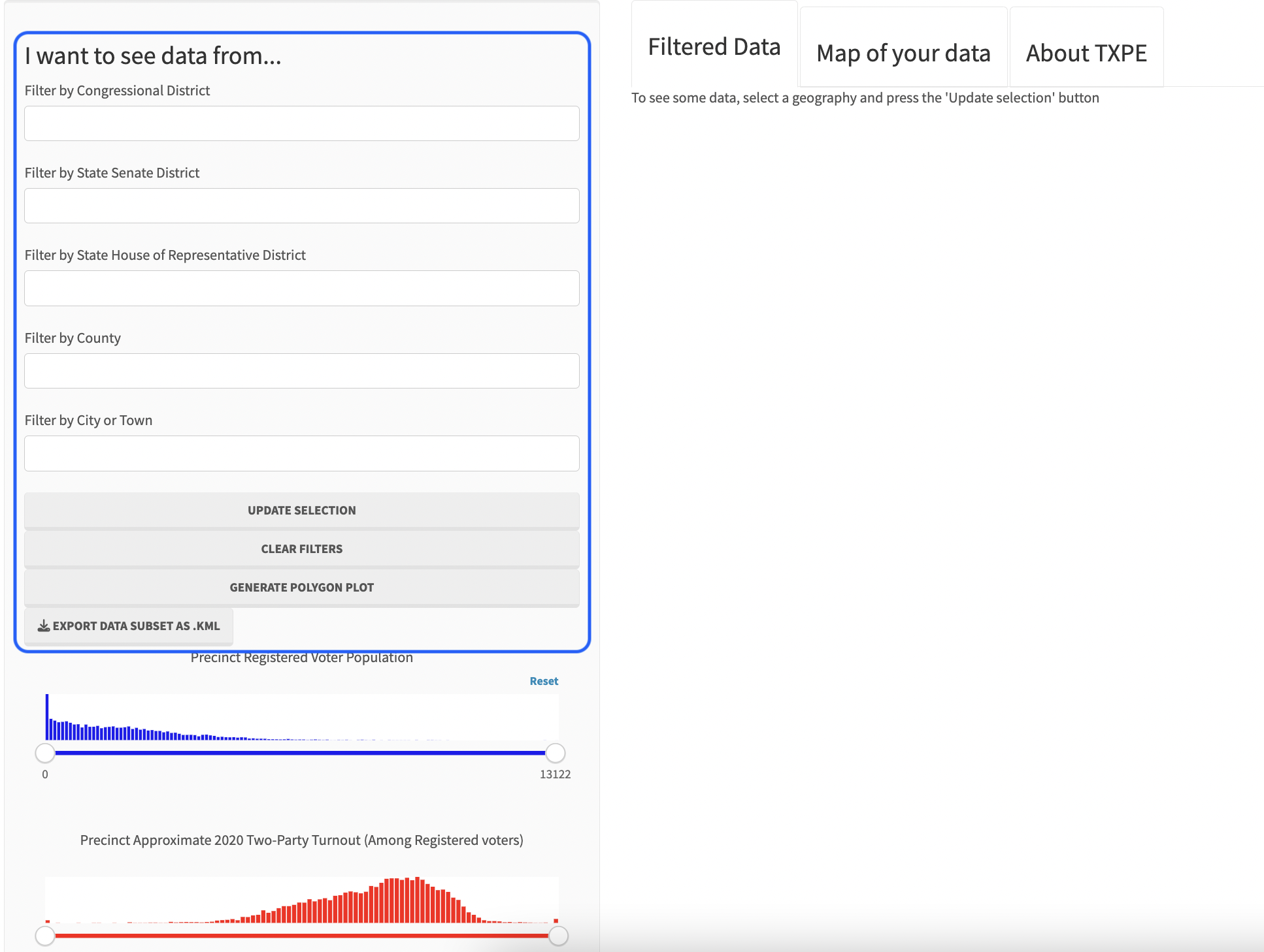
Once you’ve selected some data, you’ll see there is a lot to mess around with in the app. the results include several relevant charts and visualizations for the geography you’ve highlighted. These include information on the geography’s precincts, the signs and billboards in the geography, the radio stations in the geography, and the major roads.
The Precincts table includes a variety of political and demographic data joined together from the VEST dataset stored at the Redistricting Data Hub and Census data from NHGIS.org. For every precinct, this table includes
- The VEST precinct ID
- County, Congressional district, State Senate district, and State House of Representatives district
- Each precinct’s total registered voters, voter turnout in 2020, 2020 Trump 2-way percentage point share of the vote, 2020 Cornyn 2-way, the Congressional Republican candidate’s 2022 2-way, State Supreme Court 2020 2-way, and a measure of whether Trump underperformed or over performed the House Republican (higher numbers mean better Trump performance relative to the House Republican candidate)
- Each precinct’s population percentage that is in Gen Z (those born between 1996-2013) or retired
- Each precinct’s population percentage that is AAPI, Native American, Latino, or Black
- The share of the precinct’s population with a college degree
- Each precinct’s population density in households per square mile and the share of households that have been SNAP recipients in the past year
- The major roads in the precinct, and the major city (if any) that includes the precinct
The Billboards table includes key information from TxDOT about every roadside sign in the selected geography, including
- The precinct, county, and the lat/lon location of each billboard
- The billboard’s Texas state licensing information, including its owner
- The type of sign in question (is it a billboard/electronic, does it rotate, what is its current permit status, does it sit along an interstate, etc.)
The Radio table includes data from Radio Collector as well as some geographic information imputed using information about each radio station’s approximate broadcast area. This includes information such as
- The precinct, city, and the lat/lon location of each radio station
- The frequency on which the channel plays
- Whether the station is AM, FM or LP
- A link to additional information about each station (including how to contact the owner)
- A classification of the type of content that tends to broadcast on that station (Classic Hits, Regional Mexican, Christian, Sports, Contemporary Hits, Talk, etc.)
The Major Roads table includes data from the Census on the major roads in every Texas precinct, including the name of the road and how many of the geography’s precincts that road covers.
Once you’ve selected data you can hit Generate Polygon Plot to produce a map of the resulting data, which I always think is kind of neat to look at.
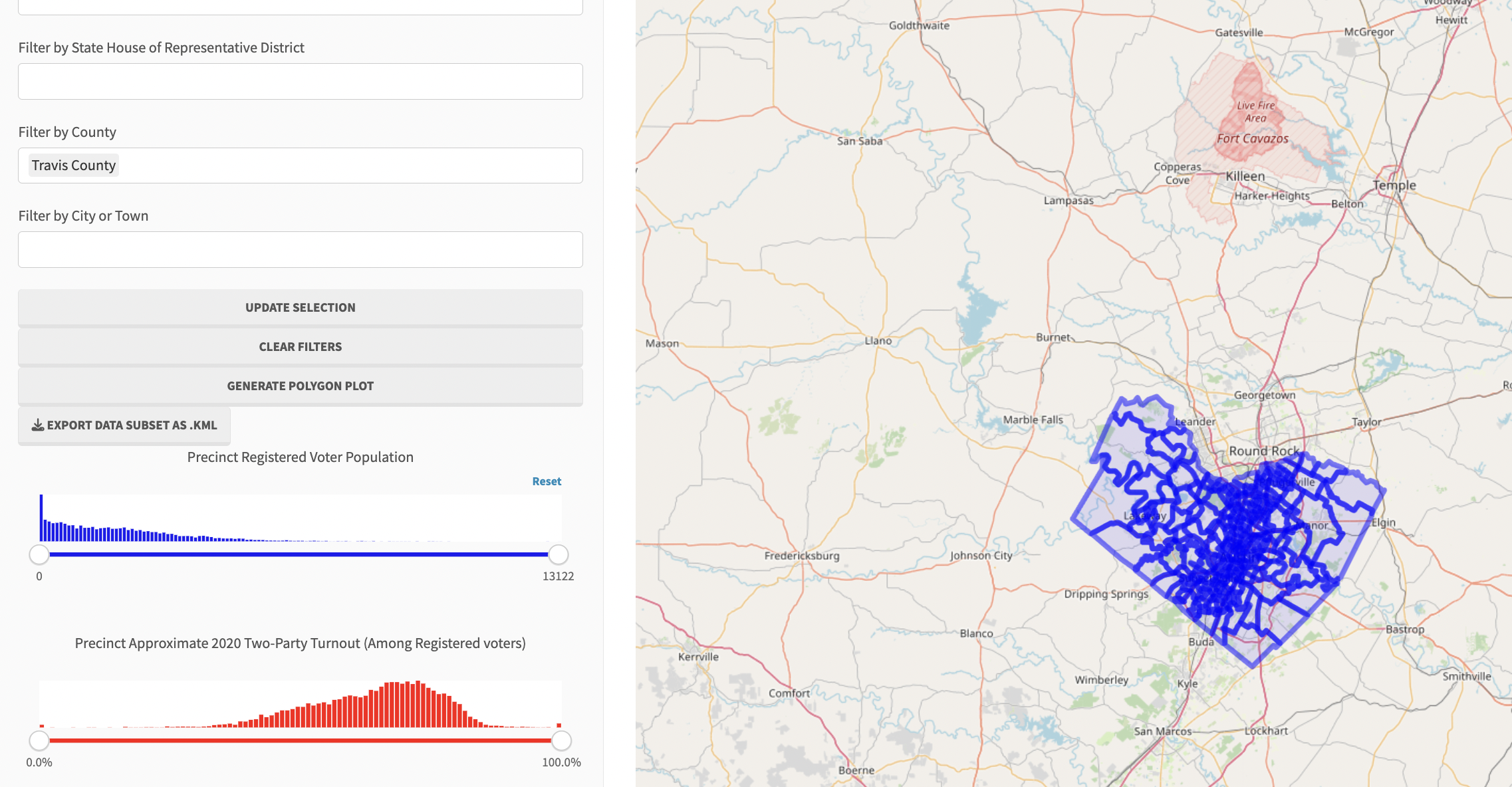
Below that, you’ll notice that you can filter your results to any or all of the demographic data present in the app. For example, if I use the filters to select only something like, say, the precincts here in Travis County (that’s Austin) that are both majority-Latino and that had below statewide-average turnout in 2020.
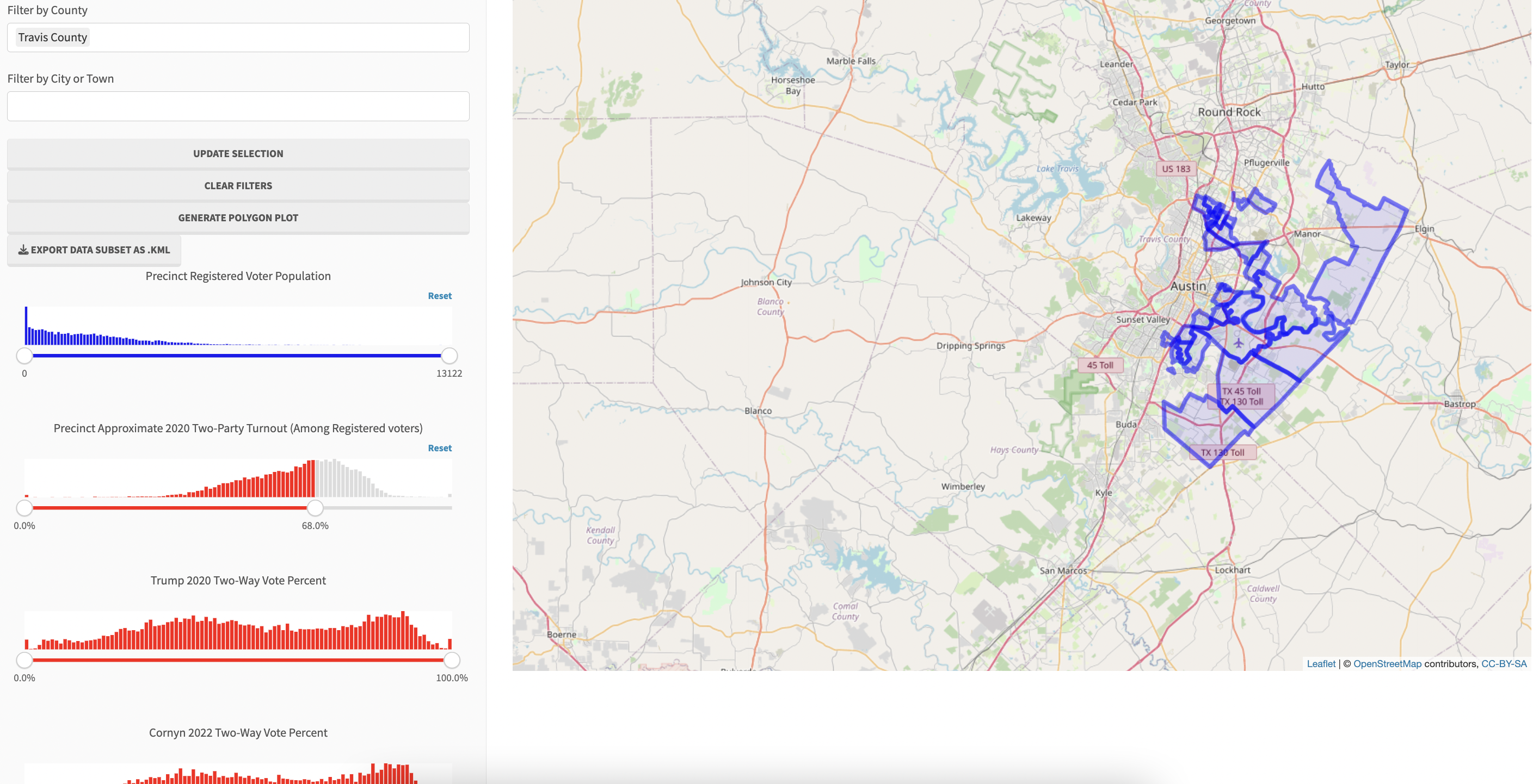
Oh, golly - that’s a lot of them! Well, its actually only about thirty precincts, but as we can see, they are very blue precincts overall indeed. And even though they are concentrated at the suburban edge of the city of Austin, we can see they are pretty high-population precincts!
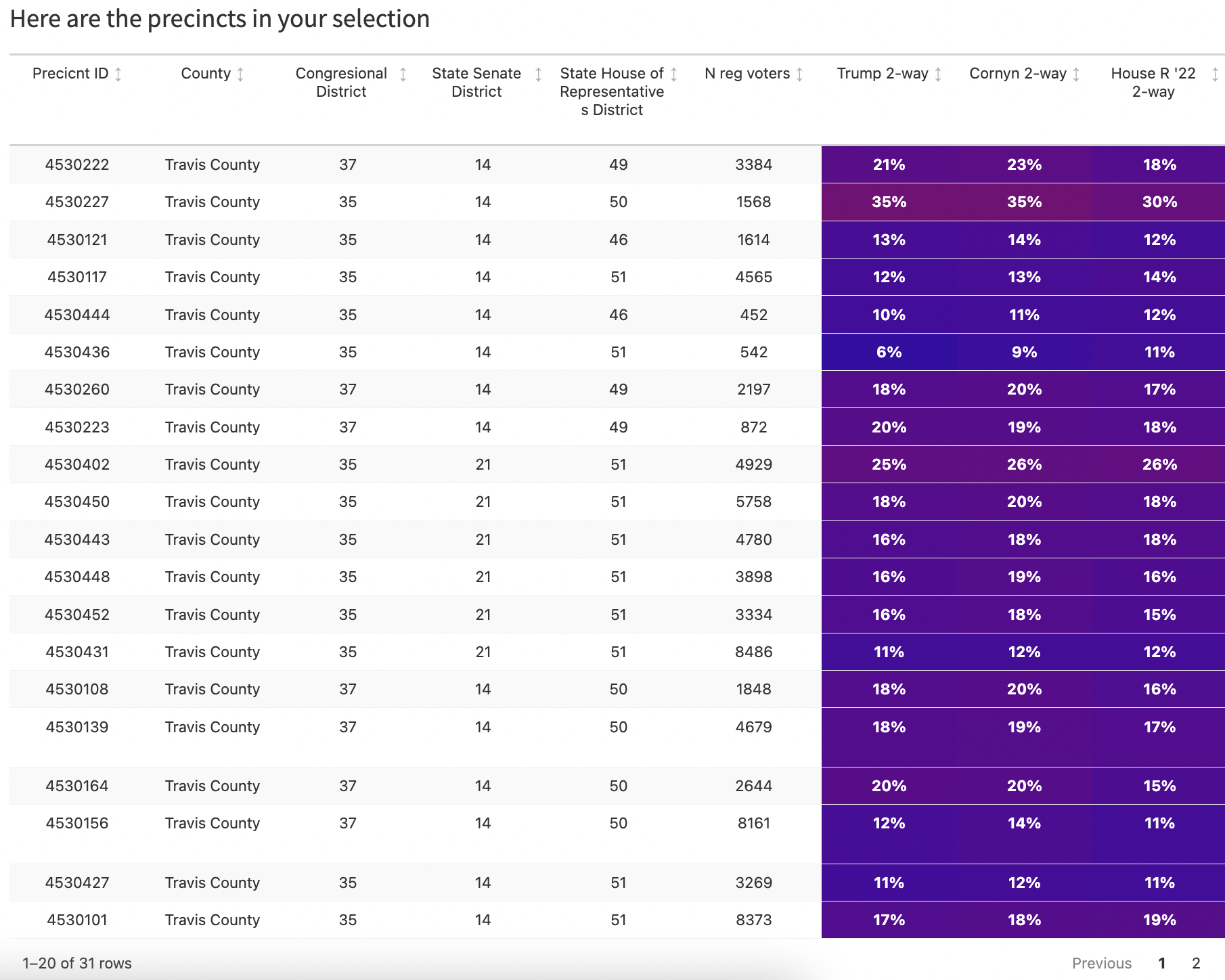
This could be a lot of votes left on the table. Fortunately, in the latest version of the app, there are now options to export both a map of your data and the data itself as a .csv
In other words, can conduct further analysis on these results using any other data you’ve got, and using any software that accepts raw data. And you can combine the .kml and the .csv data in case your analytical process involves spatial overlays.
Please enjoy the Texas Precinct Explorer and contact me to discuss what new tools would be helpful to you or your campaign! And as always, please feel free but not obligated to buy me a coffee if you’d like to support my efforts.