What happens when Speaker of House votes take awhile?
piddling
Author
John Ray
Published
January 7, 2023
Welcome to 2023. Is this anything? Who knows.
This isn’t too much of a post, but I need an excuse to get myself back into a little writing so I’m going to start off with an easy task: If I put together some plots I think are good enough to tweet, they’re good enough to keep on my blog. Seems reasonable, right? Lets look at some graphs!
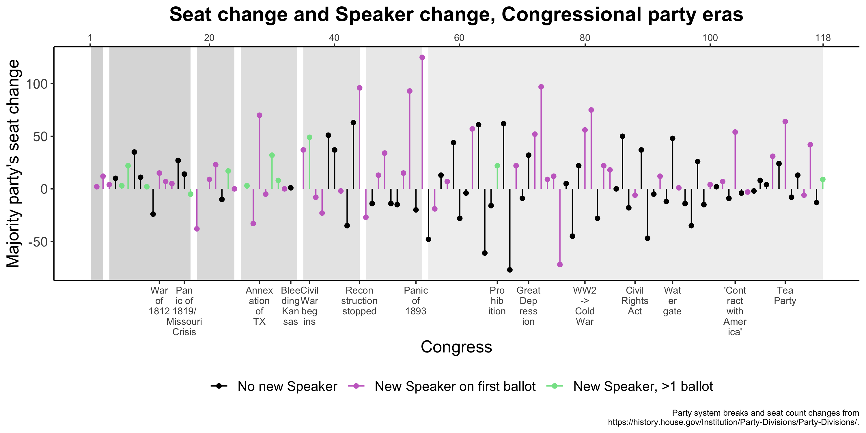
Here’s the historical context for electing new Speakers, including those who are elected on their first ballot and those who require multiple ballots. Inconveniently, history fails to tell a tidy story.
plot2 <-ggplot(dat, aes(x = (n_ballots >1), y = tenure_in_years, fill = (n_ballots >1))) +geom_violin() +scale_x_discrete(labels =c("1 ballot\n(n = 41)", ">1 ballot\n(n = 14, baybay)")) +scale_fill_manual(name ="", values =c("#FCD581", "#DA7422")) +labs(x ="", y ="Tenure as Speaker in years", title ="Tenure as Speaker in years by whether\nSpeaker vote required more than one ballot", caption ="Ballot counts from https://history.house.gov/People/Office/Speakers-Multiple-Ballots/ .\nSpeaker Tenure from https://en.wikipedia.org/wiki/List_of_speakers_of_the_United_States_House_of_Representatives.") +theme_classic() +theme(text =element_text(size =14),axis.text.x =element_text(size =8),plot.title =element_text(hjust =0.5, face ='bold'),legend.position ='null',plot.caption =element_text(size =7),plot.subtitle =element_text(hjust = .5))ggsave(filename ="plot02.png", plot = plot2, width =7, height =5)
I don’t think these graphs really tell us all that much, but I think the first one is fun to look at, at least. This data is currently on this blog’s repo or you can just DM me for the data.
 I don’t think these graphs really tell us all that much, but I think the first one is fun to look at, at least. This data is currently on